
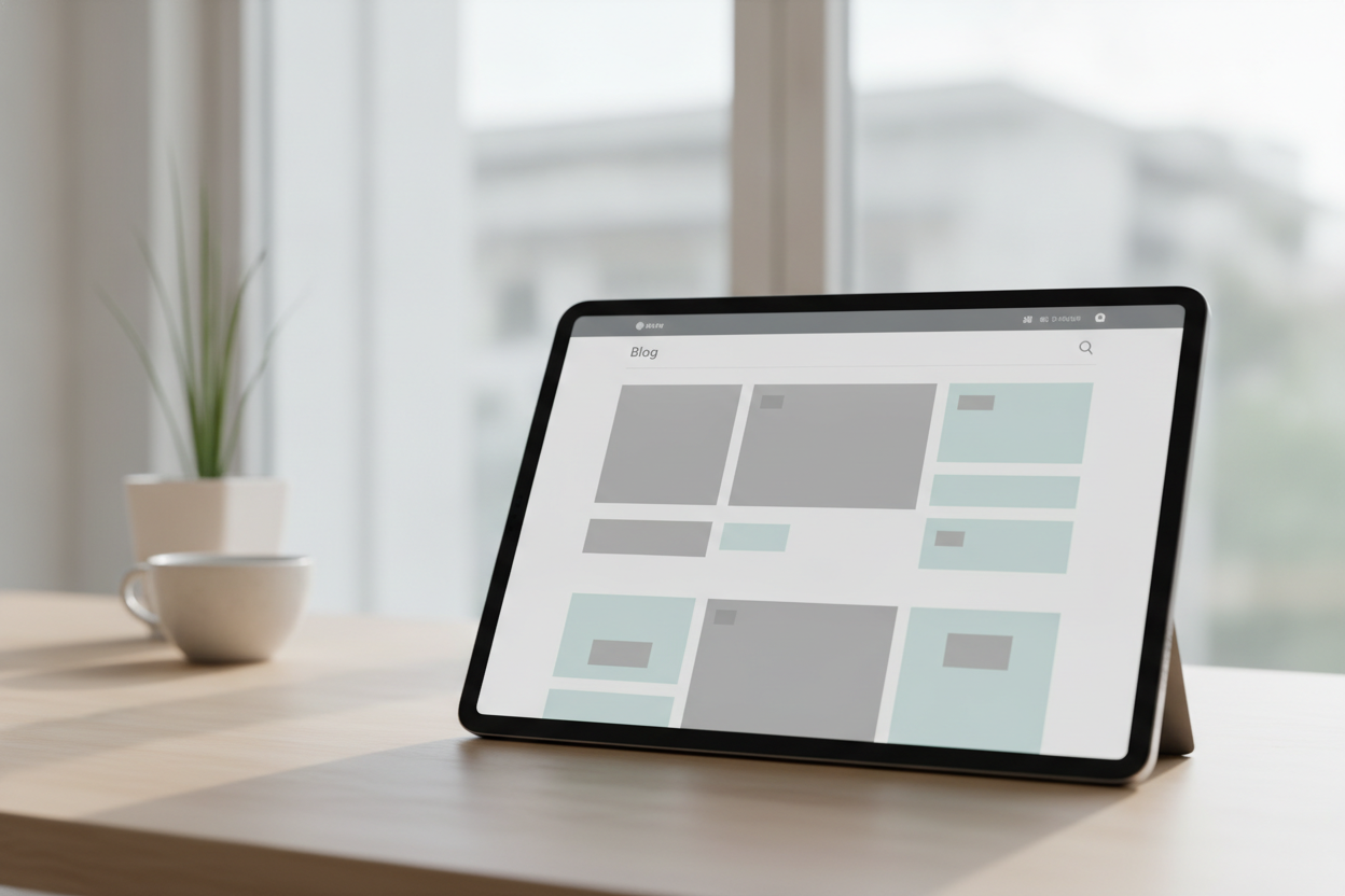
White space is one of the simplest tools in web design, but it can make a personal blog feel far more thoughtful. On a site like The Chronic Optimist, generous spacing gives each post room to breathe and helps the reader focus on the message instead of the interface. When every section is crowded, even good writing can feel harder to absorb.
In a minimalist blog, white space works like a pause in conversation. It gives the eye a place to rest and allows each paragraph to stand on its own. That is especially valuable for reflective writing, where the tone is often calm, personal, and deliberate. A little breathing room can make the reading experience feel more intimate and less rushed.
White space also improves usability. It makes titles easier to scan, paragraphs easier to follow, and the whole page easier to navigate. Readers on mobile devices benefit even more because the layout stays clean and comfortable. Instead of trying to impress with visual complexity, the blog quietly supports the words.
For personal bloggers, this approach can be a relief. You do not need decorative extras to make your site feel complete. By using space with intention, you create a blog that feels modern, readable, and welcoming. Sometimes the most powerful design choice is simply leaving room.
Leave a Reply